by Philip Wu, CMT
In one of Ken Long's nightly strategy podcasts (1) he described three trading styles, each with distinct time frames, as separate bodies of knowledge that vary in purpose and approach. There are three different trading styles: Core, Swing, and Day, as well as a combination of these known as Hybrid trading. Core trading involves holding positions for a period of two weeks or more, while Swing trading involves trades that usually last from two to ten days. Day trading refers to trading within the same day. It is possible to combine Core and Swing trading or Swing and Day trading to create a Hybrid trading approach that works together in a synergistic manner.
The aim of this blog post is to offer useful information for those interested in Core trading. To make well-informed decisions for longer-term trading, one can utilize the "three-factor model" framework, which comprises of the Market Factor, Sector Factor, and Company-specific factor
The Market Factor encompasses the state of the stock market and can affect all stocks. It includes factors such as interest rates, inflation, and investor sentiment. The Sector Factor pertains to the industry or sector in which a company operates, and its performance can impact the company's stock price. The Company-specific factor refers to the individual characteristics and performance of the company, such as revenue growth, earnings, and management quality.
While the relative importance of each factor can vary depending on the situation, it is generally estimated that 50% of a stock's price is due to the Market Factor, 25% to the Sector Factor, and 25% to the Company-specific factor. Therefore, it is crucial to consider all three factors when analyzing a stock and making long term trading decisions.
We will highlight a few resources that you can leverage for your views on Market Factor and Sector Factor.
Market Factor
For insights into the economy and macro events, I often turn to publications like Rosenberg Research (2). In their report dated February 24th, they analyzed the Index of Economic Activity from the Census Bureau, which is widely considered a leading indicator for stock prices as it offers a glimpse into the overall health of the economy. A positive growth in the index can suggest that companies are likely to see higher sales and profits, potentially driving up stock prices. This index measures the economic performance of the United States based on various factors including employment, production, and income.

Feb 24, 2023
Rosenberg Research had the following assessment on the Census Bureau report:
... What is key is the data out of the Census Bureau, which is telling us that in each of the past five months (to January 2023), the index of economic activity has come in below the economy’s potential growth rate which is, in turn, signaling a lessening of inflationary pressure....
Home prices are deflating — median house values have cratered 13% from the June peak and are now virtually flat from a year ago!
Rents are clearly declining in real-time — the Nationwide Apartment List index shows actual rents now rising just +3.3% YoY versus +8.6%.
Wage growth has slowed— no mention anywhere on the muted +1% annualized increase in Q4 unit labor costs.
So there is general concerns that the economy is slowing down faster than what others may perceive. Hopefully the Fed recognizes this trend and slows down the interest rate hikes. In the mean time, we need to be more conservative in our investment decisions.
Sector factor:
There are several tools that can help in analyzing the sectors. One of them is the Relative Rotation Graph RRG (3) that visually summarizes the relative strength trends of securities against a common benchmark.
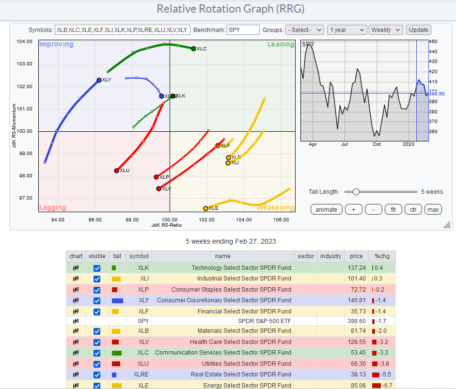
Relative Rotation Graph of S&P500 sector ETFs compared to SPY
On the weekly RRG chart, the x-axis is comparing the S&P500 sector ETFs relative strength versus SPY (relative strength RS-ratio). The y-axis measures the momentum (rate of change) of the relative strength RS-ratios.
A sector in the leading quadrant (green) indicates an uptrend in relative performance and with positive momentum. This means the bullish trend is still pushing higher.
A sector in the weakening quadrant (yellow) indicates an uptrend in relative performance, but with negative momentum. This means this uptrend is stalling or losing power.
A sector is in the lagging quadrant (red) indicates a downtrend in relative performance and negative momentum. This means this downtrend is still pushing lower.
A sector in the improving quadrant (blue) indicates a downtrend in relative performance, but with positive momentum. This means this downtrend is stalling or potentially reversing.
In general securities that are moving into the Leading (green) quadrant are bullish, whereas securities moving into the Weakening (Yellow) or Lagging (Red) are bearish.
From the weely RRG view, XLC, XLK, XLY are bullish, whereas XLU, XLP, XLY are bearish. These results suggests a risk on trade, differing from the current Market sentiment. It is possible that some of these sectors are anticipating a recovery.
RRG-style analysis can also be conducted on the stocks within each sector to identify the strongest and weakest stock performers within that particular sector.
We will provide updates to the Market Factor and Sector Factor in our future blog posts.
References:
1) Dr Ken Long strategy podcast 10/1/2022
2) RosenbergResearch.com. Free one month trial Register with 10% off coupon code AWT2023.
3) Relative Rotations Graph RRG explained